Current · Design Lead
AI-native ERP
Foodservice eCommerce
Oct 2024 — now
A custom eCommerce ERP for a 16,000-SKU foodservice & packaging operation.
HikeOn is building a multi-module ERP for a US-based foodservice and sustainable-packaging eCommerce brand — catalog, inventory across multiple warehouses, B2B and retail orders, a custom-printed-product workflow, fulfilment, returns, supplier and purchase orders, finance, and reporting on one system. I lead product design end-to-end: UX strategy, the 250+ component design system, engineering partnership on the design-to-code pipeline, and the 8+ AI use cases now live across the product.
Role
Product Design Lead
Lead Designer
Lead Designer
Team
Partnered with 1 PM,
12 engineers (Vue.js)
12 engineers (Vue.js)
Duration
Oct 2024 — present
(18 months and counting)
(18 months and counting)
Outcome
250+ components in prod,
8+ AI use cases live
8+ AI use cases live
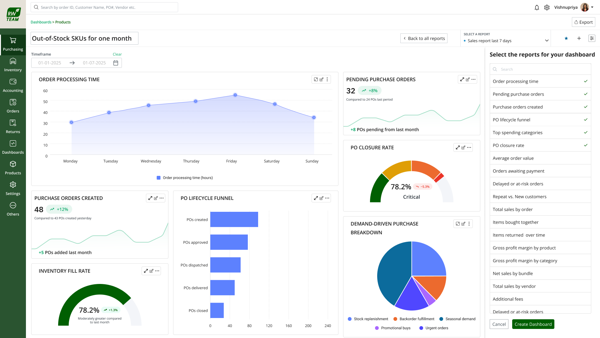
Purchasing & PO management
.png)
Product catalog — list view
.png)
Product catalog — grid view
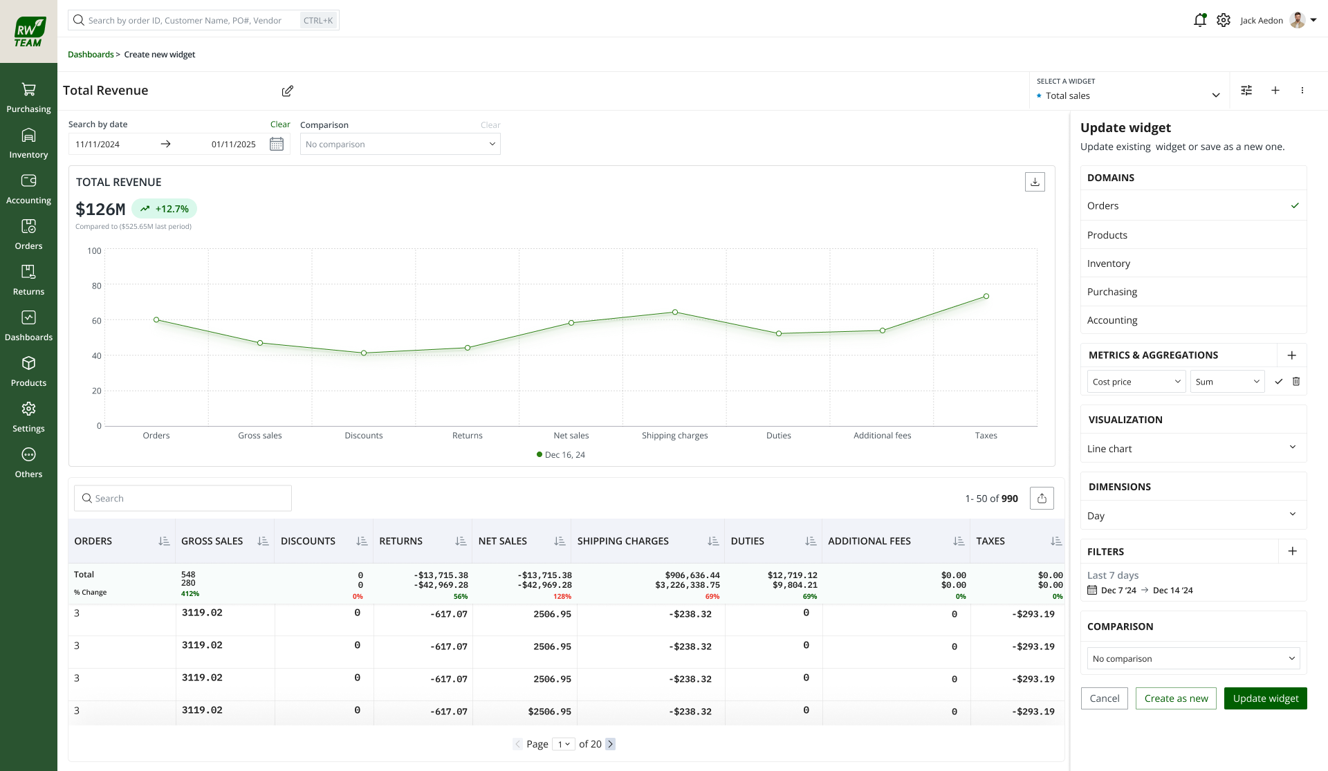
Report builder
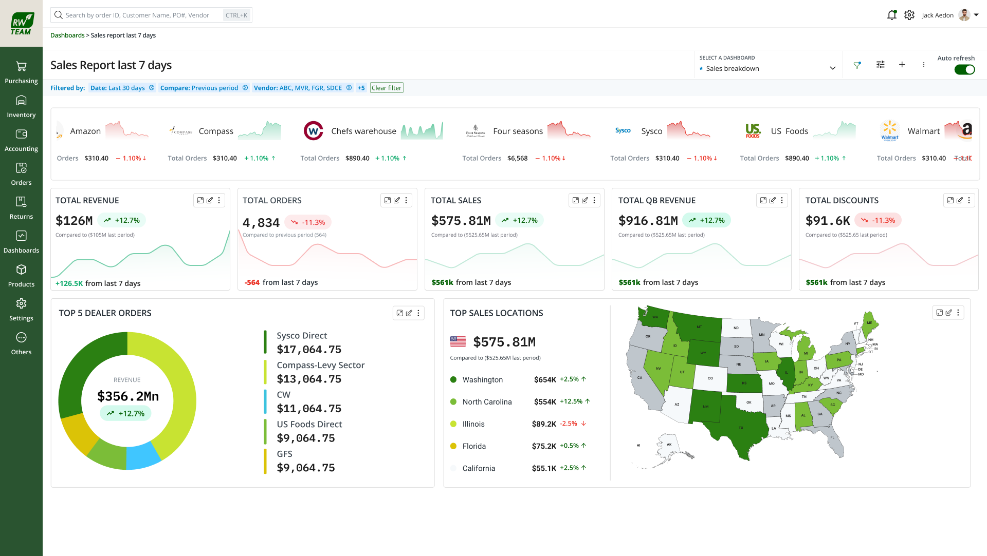
Sales reporting — 7-day view