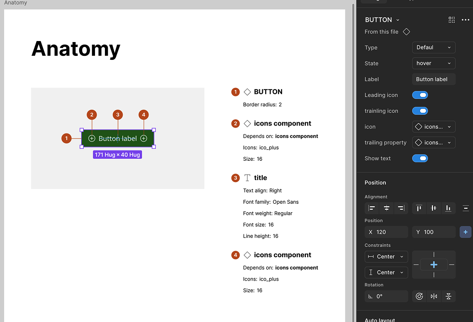
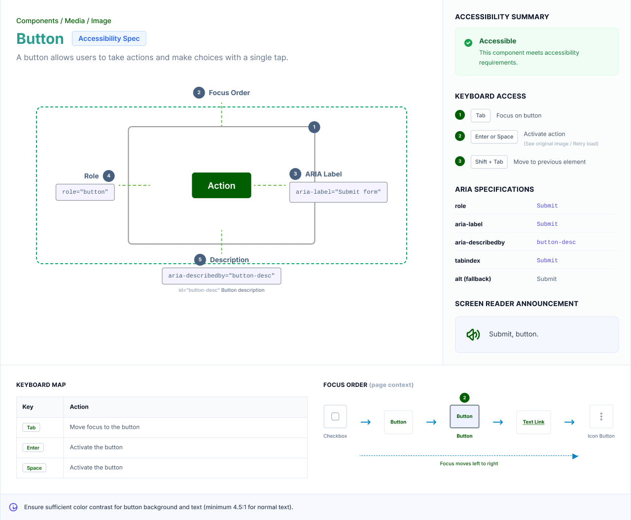
The HikeOn ERP design system is the source of truth for a custom eCommerce ERP serving a US-based foodservice and packaging brand with a 16,000-SKU catalog. I lead its architecture, governance, adoption, and tooling. This is the deep-dive companion to the HikeOn case study, focused entirely on how the system is built and how it stays healthy.
When I joined HikeOn, the product team was building a custom eCommerce ERP from scratch with no shared system. Designers improvised in each file. Engineers rebuilt similar components per module. Three problems compounded fast:
On top of that, the product had a growing surface area: order management, catalog, purchasing, AI-assisted workflows, dashboards, and customer-facing storefronts. Without a system, the team would lose more time to rework than to new features.
I didn't start with a token spec. I started with an audit. In the first weeks I catalogued every component already living across the product files, read the front-end codebase alongside it, and sat with the engineers during a real handoff to watch where intent got lost. The point was to replace "the system feels inconsistent" with something I could act on.
What the audit surfaced.
Each finding above became a goal. The five goals in the next section aren't a wishlist. They're the audit, turned into commitments.
Audit & alignment. Component inventory, codebase read, handoff observation, goals signed off with engineering.
Token foundation. Primitive → semantic → component layers; Light and Dark modes resolved in one collection.
Primitives & first composites. Built atoms, then the first real components, and locked the Figma → Vue naming contract against them.
Pipeline & handoff protocol. Storybook stories, annotation blocks, dev-mode diff checklist.
Governance & tooling. Contribution model, quality gates, and the two internal plugins.
Measure. Weekly adoption + debt metrics with delta.
Each goal maps directly to a problem the audit surfaced: same order.
Library structure. The system is split into four publishable Figma libraries. Each has a clear scope and depends only on the layer beneath it. This keeps blast radius small when a token or primitive changes.
| Library | Scope |
|---|---|
| 01_Tokens | Primitive and semantic variables for color, spacing, typography, radius, elevation, motion. No components. |
| 02_Primitives | Atomic components: icons, avatars, badges, dividers, base inputs. Consume only tokens. |
| 03_Components | Composite components: buttons, form fields, data tables, navigation, modals, charts, AI interaction patterns. Consume primitives and tokens. |
| 04_Patterns | Page-level and flow-level patterns: empty states, error states, AI confidence states, copilot panels, multi-step forms. |
Four libraries, not one. The faster setup was a single library. I split into four layered libraries instead, each depending only on the layer beneath it. The trade-off is more publish steps; the payoff is a small blast radius, a token change can't silently ripple into a page-level pattern.
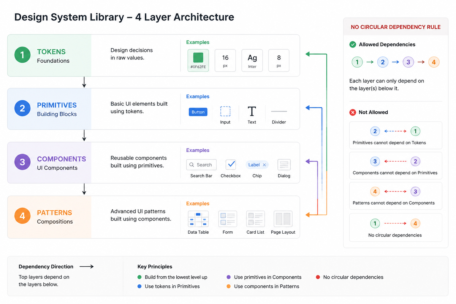
Token architecture. Tokens use a three-layer model. Primitive tokens hold raw values. Semantic tokens describe intent. Component tokens map intent to specific UI roles. This is what makes theming and white-labeling possible without forking components.
| Layer | Example & rule |
|---|---|
| Primitive | Raw values in the Colors collection (Colors:Grey/Grey-1200, Colors:brand/color-brand-900-brand, Colors:white/Color-white-1000, Colors:Pallet/Pallet-01-default). Designers never reference these in components. |
| Semantic | TEXT/text-default → Grey/Grey-1200 (Light) / white/Color-white-100 (Dark) · BACKGROUND/bg-page-primary → white/Color-white-1000 (Light) / Grey/Grey-1200 (Dark). Describes intent. Resolves per mode. |
| Component | BUTTON/bg-button-primary → brand/color-brand-900-brand · ICON/icon-active → brand/color-brand-900-brand (Light) / brand/color-brand-1500 (Dark). Maps semantic intent to a specific UI role. |
Three token layers, not flat. A flat or semantic-only token set would have shipped sooner. But a second tenant or a white-label brand would then have forced a fork per brand. The component-token layer is the deliberate cost I paid up front so that adding a brand is "a mode, not a fork." That single decision is why the multi-mode demo below works at all.
The semantic and component layers live in a single Figma collection, Global_combinations,
that resolves across Light and Dark modes. Because every component token aliases a semantic
or primitive variable, and semantic tokens even alias each other, with ICON/icon-success
and BORDER/border-input-selected both pointing at ICON/icon-active, adding a
new white-label brand is a matter of adding a mode, not forking components. The same collection is
exported to engineering as token JSON consumed by the Vue.js build, so a mode switch in Figma and a
mode switch in code use the same names.
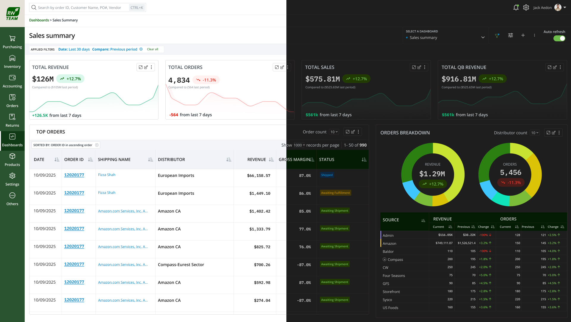
Multi-mode in practice. The charts data-visualisation palette, shown with its
real Light and Dark values straight from the collection, one semantic name, two resolved tints:
Naming conventions. Naming is the contract between design and code. Locked on day one, unchanged since:
| Element | Rule |
|---|---|
| Tokens | GROUP / role-element-variant, grouped by intent (TEXT, BACKGROUND, BORDER, BUTTON, ICON, ALERT, Status), kebab-case roles. e.g. BUTTON/bg-button-primary, TEXT/text-placeholder-muted, BORDER/border-input-selected |
| Components | Pascal-case in Figma matches Pascal-case in Vue. Button / DataTable / FormField. Variant property names match on both sides. |
| Variants | Standard set across every component: Size · Variant · State · Density. Always in that order. No component invents a new axis without review. |
| Slots | Component properties named after Vue slots: leading, trailing, content. One-to-one map to engineering. |
Lock the naming contract on day one. The alternative was to let names emerge and rename later. I rejected it: the Figma → Vue one-to-one map only holds if names are stable, and a rename downstream breaks the pipeline silently. The trade-off is real, some early rigidity, a few names I'd phrase differently today, but the contract has held unchanged, which is the whole point.
Auto Layout standards. Every component uses Auto Layout, including icons.
Branching, publishing, versioning.
main are blocked by convention and called out in review.This works because the structure is identical on both sides, names, props, slot names, token references all map one-to-one.
| Figma | Vue.js |
|---|---|
| Component name | Vue SFC name. Button.fig → Button.vue |
| Component property | Vue prop with matching name and type. Variant=primary → variant: 'primary' |
| Boolean property | Vue boolean prop. Disabled=true → disabled: true |
| Slot property | Vue named slot. Leading → <slot name="leading" /> |
| Variable (token) | CSS custom property exported by Style Dictionary. color.bg.brand → --color-bg-brand |
| Variant matrix | Storybook story per variant combination, generated from the same matrix. |
Handoff protocol.
I vibe-coded two internal plugins using Cursor and Claude Code to automate the parts of system maintenance that were eating the team's time. Both are in active use.
Problem: As the system grew, designers in different modules quietly recreated near-duplicates. Audit was a manual, multi-day job.
What it does: Scans the file, clusters near-duplicate components using structural and semantic similarity, and surfaces consolidation candidates with side-by-side diff previews.
Problem: Detached instances, hardcoded colors that bypassed tokens, deprecated components still in use, missing variants. Design debt was real but invisible.
What it does: Audits files for all four categories and exports a triage report with file, frame, and component references. Tracks delta week over week.
AI in the daily workflow. Beyond the plugins, AI is part of how the team works. Cursor + Claude Code for plugin development. Google Stitch + Gemini Code Assist for prototype generation. Claude for documentation drafts and decision-record summaries. The principle: automate the repetitive, free the team for the judgment calls.
| Role | Responsibility |
|---|---|
| System owner (me) | Roadmap, architecture, breaking changes, final review. |
| Core contributors | Two designers and one front-end engineer. Triage intake, build and review components, maintain documentation. |
| Product contributors | Any designer or engineer outside the core. Can propose and build, with required review steps. |
Contribution flow.
Where the "no new axis without review" rule came from. Early on, a product contributor built a new component with a custom variant axis that read perfectly in isolation. In review it broke two things at once: the shared mental model across components, and the one-to-one prop map to Vue. Working with the Engineering Architect, we collapsed it back into the standard Size · Variant · State · Density set in the same session. That incident is why the rule exists, it wasn't handed down, it was learned. The Engineering Architect now signs off on every implementation plan at the Review step for exactly this reason.
Quality gates. No component ships without passing all four:
A design system claims its value; it doesn't get to assert it. Two numbers run on a weekly cadence and get read out in design review, with the delta from last week.
One loop, start to finish. When the debt report flags a cluster of detached instances in a module, we trace them to their source: usually a frame that predates the canonical component, or a contributor who wasn't aware it existed. We rebuild that module on the system component and log it as a system bug. Not a per-screen patch, so the same class of issue doesn't recur. The next week's report shows the delta. That loop is what turns a dashboard into a practice.
Lock the token JSON export contract with engineering on day one. We retrofitted it later and paid a small migration cost.
Start the Design Debt Collector plugin earlier. By the time it shipped, we already had a backlog of debt to triage.
Invest in dev-mode-ready annotations from the first component, not from the tenth. Going back to annotate is slower than annotating as you build.
The system is a living product, not a deliverable. Treating it that way, with a roadmap, contributors, release notes, quality gates, and metrics, is what keeps it healthy as the surface area grows. The work continues. (Closing principle)